

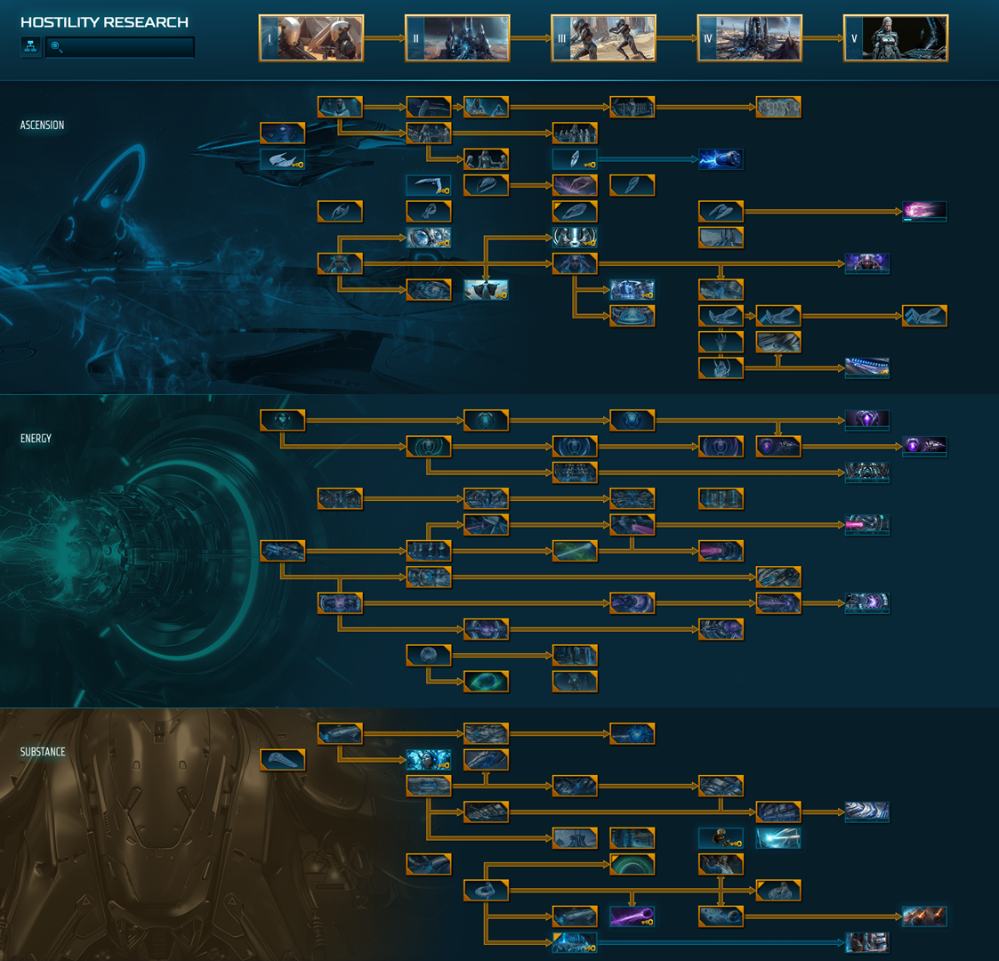
Research layout and icons visually noisy
Published on Tuesday, January 27, 2026 By
One of the major things that stands out the most as troublesome compared to sins rebellion, is the readability of the research. The icons have overly detailed images that look interesting but are not as clear as to what they are for. To find simple stuff like shield upgrades or especially resource acquisition boosts, i found myself having to read through everything one at a time to fish for the desired research.
Too many icons for different types of research look too similar and they're huddled together a bit too much as well. For example the oblivia dreadnaught research is almost touching the vex amplifier research, giving the impression they're connected but they're not. The planet type colonization researches don't have a clear signifier that they're for colonization, they're just random vistas on the planets they relate to, and can be confused with other researches for planetary bonuses.

Compared to the much more well organized and distinct icons of the previous: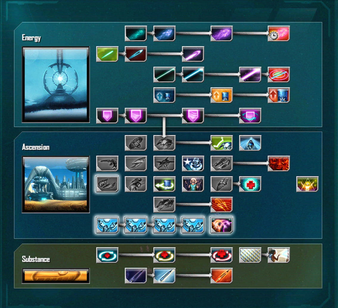
While it is very understandable to want to modernize the icons and make them pretty, as the old icons definitely do show their age, but they excelled at being very clear as to what they are for. Each purpose has a clear design trope it sticks to, with simplicity and colour distinction as well. The shield upgrades are a stark pink with a shield icon, with increasing size and lines in it for each level. The beams are clearly lines with the same orientation and only distinction in the intensity between each level.
Clear intuitive readability is important for reducing friction with the part of the game that requires the most contemplation to be proficient. I'd suggest either redesigning them, or adding some kind of indicator like a little icon in the corner or something, but generally having some kind of font or design language that better groups and categorizes researches.